
Evolve Same Sky into The Good Between, keeping Business. Brand. at the centre.
Our own brand / Identity & art direction
The Good Between
An identity built around connection.

The brief
A new name.
A clear foundation.
The connection is the idea.
A connected symbol brings different strengths together. Characterful typography balances clarity and expression.
Logo, colour and art direction carry that idea across the website and workspace.
The visual system
Distinctive.
Connected. Clear.
Blush
Oxblood
Warm Orange
Paper
Art direction
A world of
connections.
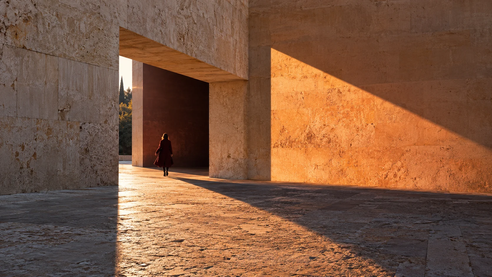
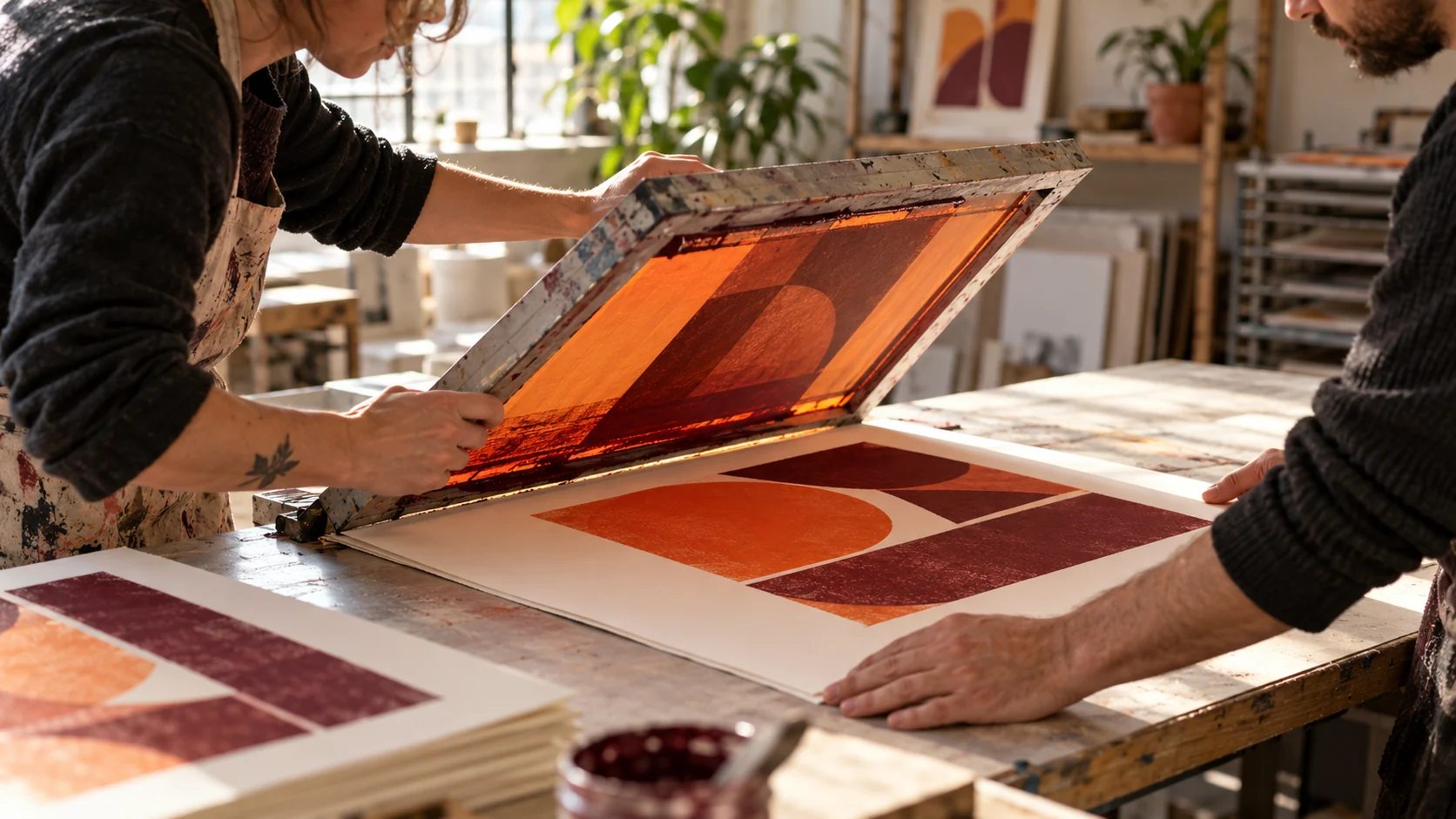
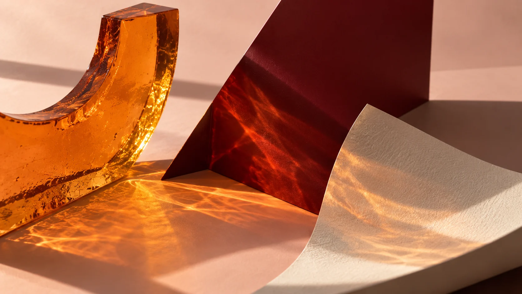
Four illustrative brand studies explore connection, making and materials — not client work or commercial results.

What does your
business need next?
info@thegoodbetween.globalStart a conversation
Existing client? Sign in